Updates
February 3, 2014
Justin
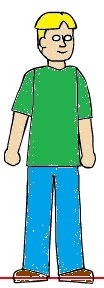
So, I drew Justin. There's some proportion issues here I'm not thrilled about. But, nevertheless, he's mostly done. His head is a strange shape, and I'm not sure how to fix it, but maybe it's a defining characteristic. If these characters end up in costumes, at least you'll be able to tell them apart by the shape of their melons. He's also a bit darker skinned than the rest, because it was getting kind of washed out in this cast, and Brad isn't going to change things. I've at least seen Cody with a tan, I know it can happen. Oh, here's Justin (for now):
I feel like Justin is a bit more realistic than the others. Maybe it's his skin tone. Or his oddly tiny eyes (not sure how that happened) but I'm okay with it. Justin is super easy to draw, probably because he has the least excessive detail. His hair is simple, he has no glasses, or commanding eyebrows. Which is fine, because half of the time, he'll be on fire, anyway!
In the spirit of conformity, here's a Justin composition. I don't know how he developed that sweet widow's peak, but it's staying:
Brad
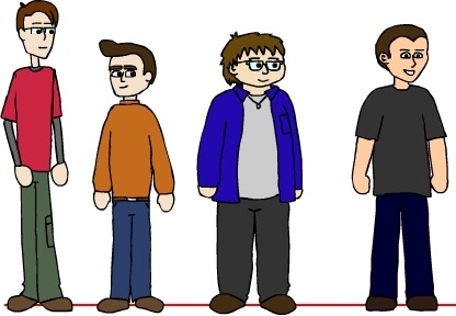
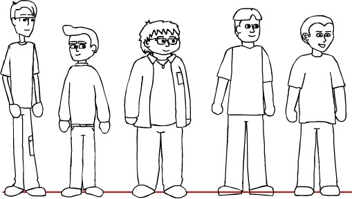
Also, since the last update, I took a stab at drawing Brad. You might have noticed he's missing from the lineup, although the original sketch had him positioned next to Brandon. That's because I forgot to do an update after Justin, and had to take him out for that picture.
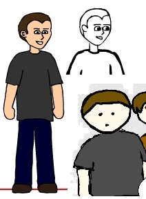
Let me just preface the following image by saying I'm not pleased. Every time I draw Brad, he looks like a charicature, but not a good one. He never looks the same as the others, style-wise, he looks dopey, and I really don't know why, or how to fix it. If everyone had generic heads and bodies, with different palettes to distinguish them, I'm sure he's still look awkward:
...Yeah. I mean, it isn't far off, the body is fine, but that's because there's nothing special about it. Maybe his arms are at a weird angle, that that's irrelevant when I get into things. Actually, his shoulders look a lot better than Justin's, I might have to try and replicate that. It's mostly the hair, I guess. I was initially not a fan of his head shape, and I'm still not. Here, I used Paint to throw some colour at it:
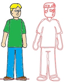
He doesn't look horrible, but that's because he's on his own. If I put him next to any of the others, he stands out like a sore thumb. Here, I'll even take the colour out of the others, so it's a fair comparison:
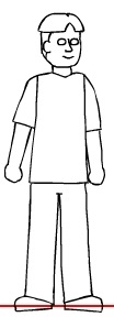
I think maybe his eyes are too small, too. I copied over the pupils from my initial sketches, and I had to shrink them a lot. He just looks cartoonish. Not that I have drawn accurate, realistic representations of the others, but Brad always turns out so strangely. Even compared to the original wireframe, upon which this is based. In fact, upon which this was drawn over:
I wasn't satisfied with the wireframe sketch, but I did not make things better by tracing over it and making changes. I'd almost rather colour in the sketch and use it. I meant to leave Brad for last, but I jumped the gun and this is not pleasant.