Updates
January 26, 2014
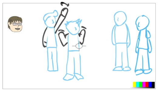
I started by making a 30 second "animatic," which is sort of a moving storyboard. No detail, just shapes to show where things will need to be, and when. Also, setting up where the camera (vcam) will be pointing, and how zoomed in or out. Once the characters are done, I just pop them in where I indicate they need to be, and everything else is already done. This is the final screen, although some characters are missing:
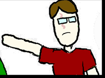
The coloured-in head (Brandon) was my first real attempt at some detail work. I left it in this screen, because I also designed him to speak. He mouths the word "Hello" and sort of mumbles "My name is Brandon." Anyway, I didn't mind the look of it, but when I started drawing another character (Brad) I couldn't get them to look like they belonged in the same universe.
So, I created a new file in which to design my characters, that way I could save the resulting symbols to the library, and load them in the other project. Another YouTube tutorial, not by Jazza, about character design showed me that I could start with simple shapes to get a feel for the characters, and build up from there. Here are my initial body forms:
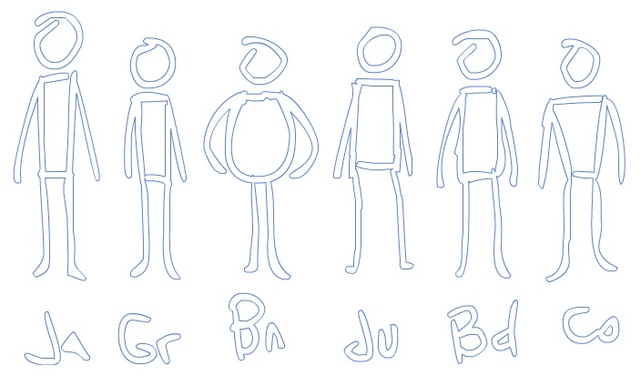
Already, I was liking what I was seeing. They looked distinct. But they needed proper heads, so I worked on creating heads that were roughly the same size, but unique shapes. I came up with the following:
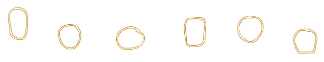
Tall, round, squared, short... just a few tweaks, and there you have it. I had listed out adjectives for each character on paper, even though it was all in my head already. It helped me to understand and conceptualize what I wanted to end up with.
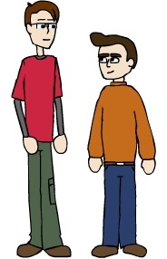
Once I had the shapes down, I drew in the bodies. I don't know why I started with the bodies. Maybe because I was nervous about making the heads look cohesive. Anyway, I came up with this "Usual Suspects"-esque result. The lines were actually there just so I could understand the heights of all the characters, where their waists and shoulders were, and make sure they were standing on the same level:
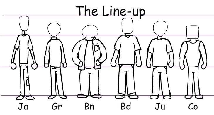
I know it wasn't required, but the bodies felt too stiff to be my characters, and I wanted to play with the mistaken-theme of the original picture, so I moved some limbs, and had them hold signs for their names. I don't know why I use this periodic table-style naming convention.
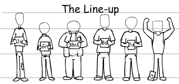
And once I was done doing things that weren't relevant to the task at hand, I filled in the faces. By this time, I'd posted most of these pictures on Facebook, and received a positive response from those involved.
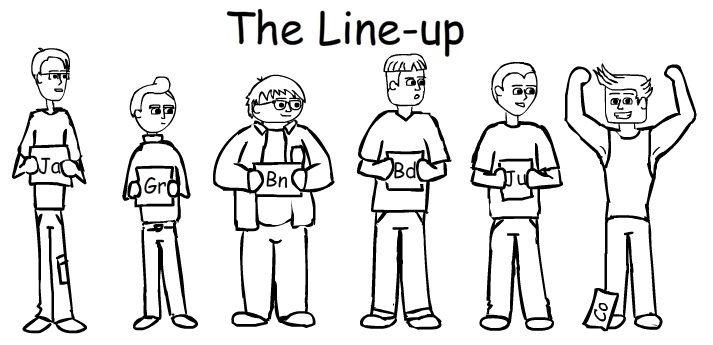
Once I had these, I started cleaning it up. I had to draw most parts separately on different layers, so that Keyframe Caddy would work (basically, I draw, say, a head, then turn it into a symbol so it has it's own layers and frames inside it, so I can go inside and do things like make the eyebrows in different positions, or make different mouth shapes).
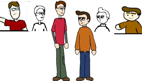
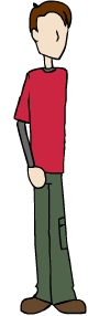
Started with myself, partly because I couldn't be offended by what I drew, and mostly because I was first on the left for some reason. I didn't lay them out in that order for any particular reason.
One issue I discoverd was that I'd pretty much draw all the rough head shapes facing to the right (except Cody). I mean, I could move the eyes and the nose over, but the chin dictated that the head was actually turned. It's subtle, but I actually redrew my face to be more centered.
Not bad, considering how it was drawn the first time around:
Don't get me wrong, I don't hate anything about how I drew the comic. I love those characters, they allowed me to bring those characters to life. And I definitely considered doing the animation with that original style. I just felt that an updated look would be a better idea.
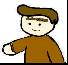
Next, I drew Greg. He went through two stages. Initially, I thought he looked fine. Then, I realized his face was a strange shape, so I redrew him with a chin:
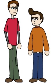
Then, while compiling a picture that showed how these two characters have evolved, I realized that the exaggerated hair I had drawn was just too much. Here's the original:
I don't know what I was thinking. So, I toned the hair down a little, maybe too much, and ended up with this:
Greg was always my favourite character, I don't know why, so I want to make sure I'm happy with his design, above all else. I think it's the hair, along with actual eyebrows, that gave him an excessive amount of character. I need him to retain that, and maybe I'll tweak a little more. I think his eyebrows need to be lighter, so his face doesn't feel so dark. Here's the composite: